Law of Prägnanz: Why the Brain Always Chooses the Simplest Form
The Law of Prägnanz explains why the human brain naturally prefers simple, organized structures. In UX design, simplicity is not decoration—it’s a psychological shortcut that makes interfaces clearer and easier to understand.
Introduction
Humans don’t enjoy visual chaos.
When the eye sees a busy, unstructured interface, the brain is forced into “puzzle-solving mode.”
And that’s the opposite of a good user experience.
The Law of Prägnanz states:
The mind always chooses the simplest and most stable form.
This isn’t an opinion—it’s how cognition works.
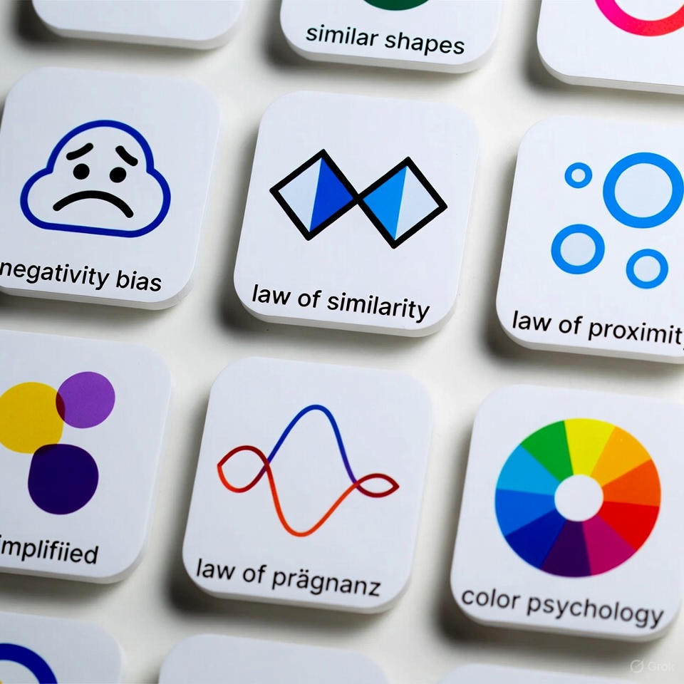
What Is the Law of Prägnanz? (Simple Explanation)
The word “Prägnanz” means good form or simplicity.
The brain constantly tries to:
Simplify complex inputs Group scattered elements into a unified shapeRecognize familiar patterns quickly
If the interface is complex, the brain will try to simplify it on its own—often incorrectly.
Why the Law of Prägnanz Is Critical in UX
1) Reduces Cognitive Load
Less effort → more clarity.
2) Speeds Up Decision-Making
Simple shapes are processed faster.
3) Improves First Impressions
Clear structure = higher trust.
4) Minimizes Visual Noise
Patterns guide the eyes effortlessly.
How to Apply the Law in Your Design
• Use simple icons
• Group related content visually
• Remove unnecessary details
• Use whitespace strategically
• Maintain consistent layout patterns
Real App Example: Spotify — A Masterclass in Visual Simplicity
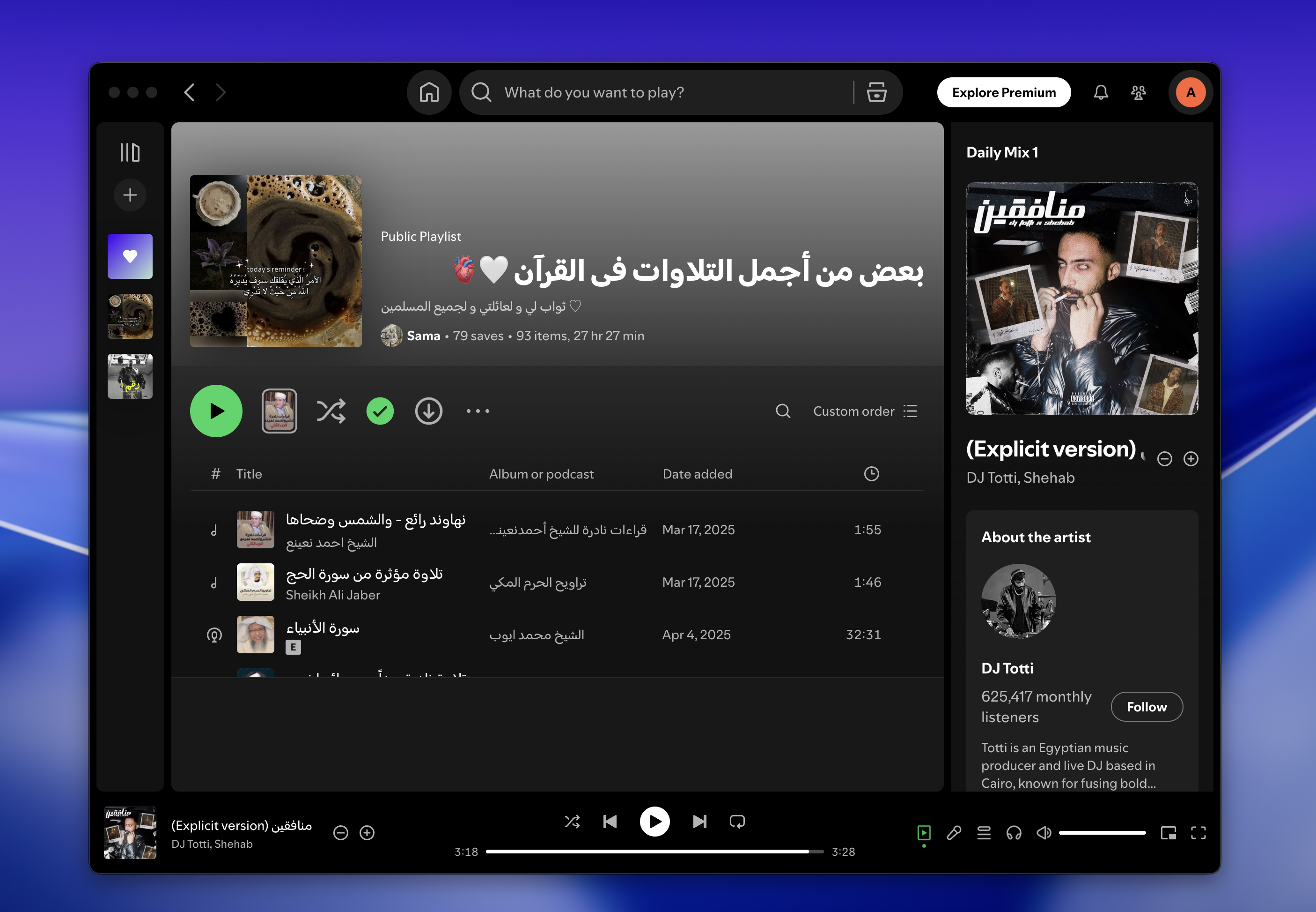
Spotify has enormous content… yet the experience always “feels simple.”
That’s Prägnanz in action.
How Spotify Applies the Law
Shows only what’s essential
Uses predictable patterns
Relies on simple, universal icons
Maintains clean visual hierarchy
3 Strengths in Spotify’s Use of Prägnanz
1) Consistent layout
Users instantly understand the structure.
2) Fast screen scanning
Information is digestible at a glance.
3) Reduced cognitive effort
Even with massive content, the interface feels lightweight.
3 Weaknesses Despite the Simplicity
1) Screens may feel too similar
New users may struggle to distinguish sections.
2) Heavy reliance on icons
Some icons can be ambiguous across cultures.
3) Hidden details
Some settings are buried due to simplicity-focused hierarchy.