Web Scanning Patterns: Complete Guide to F-Pattern, Z-Pattern & Layered Approach (2025)
Web scanning patterns describe how users visually navigate webpages. These are not random movements — they follow predictable paths
based on the user’s goal and the page layout.
Understanding these patterns has become essential for UX designers, web developers, and digital marketers because they directly impact user experience and conversion rates.
The 3 Most Common Web Scanning Patterns
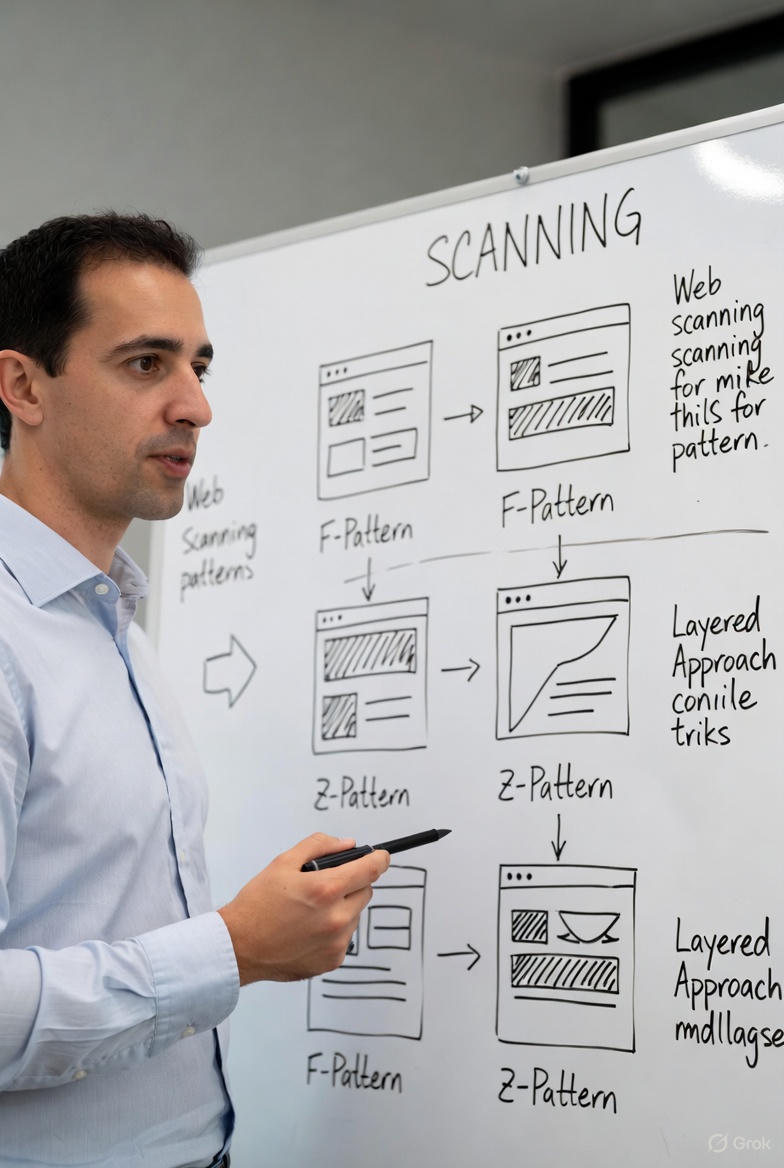
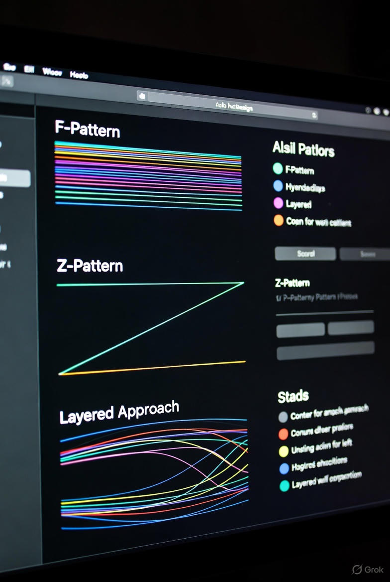
1. F-Pattern (F-Shaped Pattern)
Dominant on text-heavy pages (blogs, articles, search results).
Users read horizontally across the top, then a shorter horizontal movement lower down, followed by a vertical scan down the left side.
Proven by Nielsen Norman Group studies: over 80% of users follow this pattern when searching for specific information.
2. Z-Pattern (Z-Shaped Pattern)
Ideal for simple, conversion-focused pages and landing pages.
Eye movement:
Top-left → Top-right → Diagonal down to bottom-left → Bottom-left → Bottom-right
Widely used in advertising and pages with a single clear call-to-action.
3. Layered / Layer-Cake Pattern
Users skip long paragraphs and focus only on:
- Headlines and subheadings
- Images and visuals
- Bullet points
- Bolded keywords
Similar to a child eating the frosting off a cake first.
How Task Type Affects Scanning Behavior
| User Task | Most Common Pattern | Expected Behavior |
|--------------------------|-------------------------------|------------------------------------------|
| Information seeking | F-Pattern or Layered | Skim headings → deep reading when relevant |
| Browsing / Shopping | Z-Pattern or Layered | Focus on visuals and prominent offers |
| Completing an action | Focused reading (not scanning)| Careful reading of instructions |
How to Apply Scanning Patterns in Web Design
1. Place your most important elements in high-attention "hot zones":
- Top-left area
- Upper left sidebar
- Corners of the Z-path
2. Create a strong visual hierarchy:
- Clear H1, H2, H3 headings
- Short paragraphs (3–4 lines max)
- Generous white space
- High-quality visuals
3. Guide users to conversion:
- Position primary CTA buttons where the eye naturally stops (end of Z-path or F-stem)
By aligning your design with natural scanning patterns, you create faster-to-understand, higher-engagement, and higher-converting websites.