What Is the Law of Proximity? And How Does It Shape User Perception of Interfaces?
Have you ever looked at a screen and instantly understood which elements belong together—without borders, boxes, or separators? That’s your brain at work.
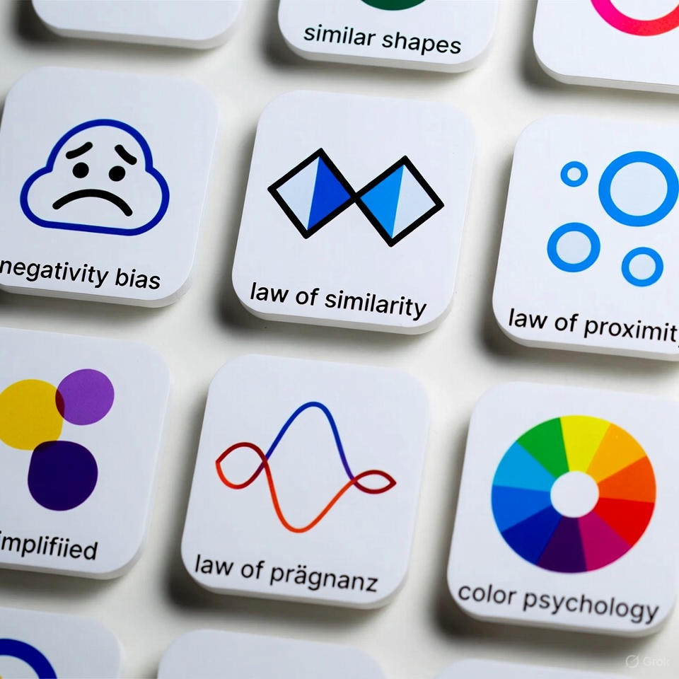
The Law of Proximity—one of the core Gestalt principles—explains why simply placing elements close to each other changes how users interpret them.
In UX, this law can create clarity and structure… or confusion and chaos if ignored.
What Is the Law of Proximity? (Simple Explanation)
The Law of Proximity states that elements placed near each other are perceived as a group, even if they don't share borders or colors.
In other words: Distance = Meaning.
The brain uses spacing to predict relationships.
Why the Law of Proximity Matters in UX
1) Faster Information Processing
Users understand structure instantly—just by glancing.
2) Reduced Cognitive Load
You remove the mental effort of connecting unrelated elements.
3) Improved Scanning and Readability
The eye moves between grouped blocks, not scattered items.
4) Avoids Interface Confusion
Without proper spacing, elements look glued together and unclear.
How to Apply the Law of Proximity in Design
1) Group related elements
Button + label Heading + description Icon + text
2) Add larger spacing between unrelated groups
This helps the user distinguish sections instantly.
3) Use spacing instead of boxes
You don't always need borders—the distance does the job.
4) Keep spacing consistent
Equal spacing = predictable visual structure.
Real App Example: WhatsApp — A Perfect Demonstration of the Law of Proximity
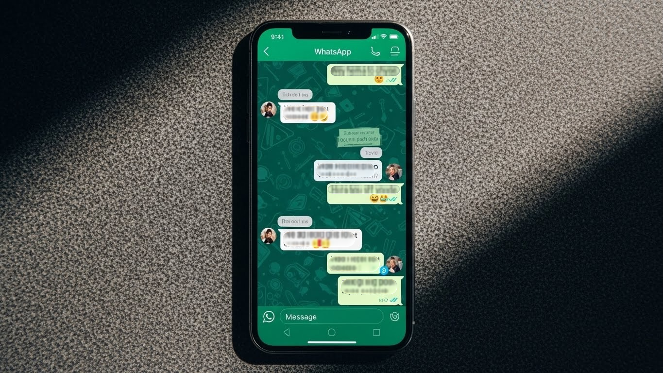
WhatsApp is one of the clearest examples of how spacing alone can organize large amounts of information.
How WhatsApp Applies the Law of Proximity
Each message bubble has minimal inner spacing → perceived as one unit.
Clear spacing between messages → easy separation.
Tabs (Calls – Chats – Settings) are spaced apart → enabling quick visual scanning.
3 Advantages of WhatsApp’s Use of Proximity
1) Extremely Fast Reading
Groups are visually clear—no clutter.
2) Clear Conversation Boundaries
Different spacing sizes create a readable rhythm.
3) Reduced Visual Effort
Whitespace provides breathing room and comfort.
3 Drawbacks Despite Good Application
1) Small gaps between voice messages
Sometimes creates unwanted visual merging.
2) Spacing varies across devices
Which can affect readability on certain screens.
3) Group chats can get visually messy
Especially when images or links appear back-to-back.
Common Mistakes to Avoid
❌ Grouping unrelated items just because they are close ❌ Very small spacing between different sections ❌ Adding unnecessary borders instead of using spacing ❌ Ignoring screen size differences and layout behavior