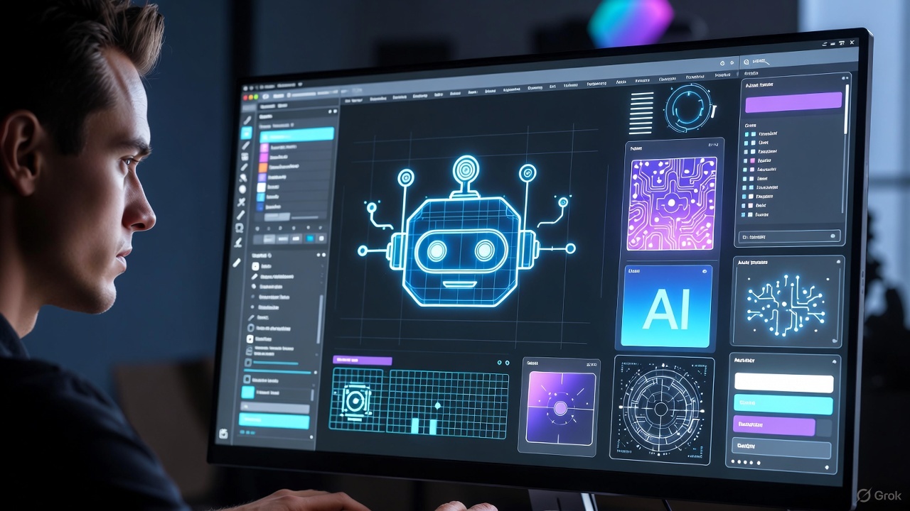
What Is the Law of Similarity? And Why Does the Brain Use It to Organize Information Automatically?
Introduction
Have you ever noticed that when you see elements that look alike—even if they’re not close to each other—your brain instantly groups them together?
Same color… same shape… same size… any small similarity makes the mind say: "These must belong together."
That’s exactly the essence of the Law of Similarity, one of the most important Gestalt principles that shapes how we interpret interfaces and process information.
Similarity isn’t just aesthetics—it’s a powerful cognitive tool. Use it well → you get clarity and order. Ignore it → you create noise and confusion.
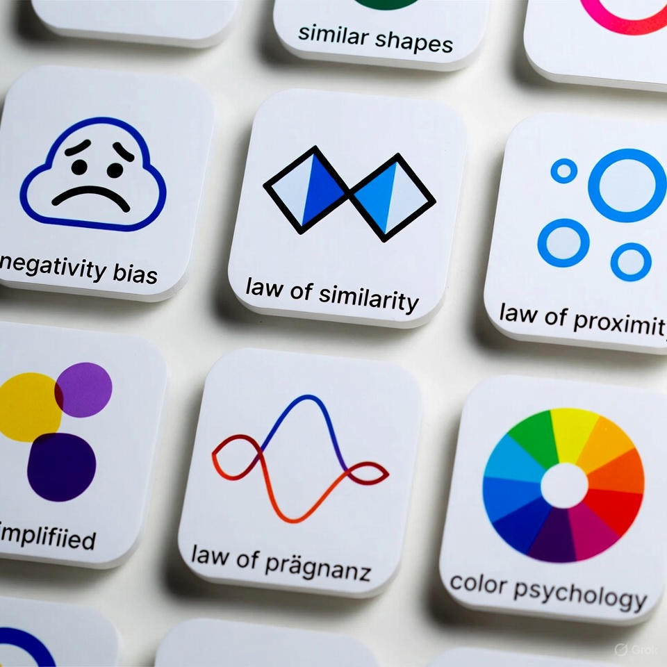
What Is the Law of Similarity? (Simple Explanation)
The Law of Similarity states that: The human mind groups similar elements together—even if they are physically distant.
Similarity can appear in:
Color
Shape
Size
Direction
Pattern
Icon style
The brain treats similarity as a signal of relationship.
A simple example:
If you have 10 circles and 3 of them are blue, your mind instantly groups the blue ones—even without proximity.
Why the Law of Similarity Matters in UX
1) Creates a clear visual structure
The mind relaxes when related elements look consistent.
2) Faster scanning and navigation
The eye moves through patterns—not isolated items.
3) Reduces mistakes
If key buttons share the same color or shape, the user won’t hit the wrong action.
4) Strengthens visual identity
Similarity builds a unified, predictable interface.
How to Apply the Law of Similarity in Design
1) Use consistent colors for consistent actions
Primary buttons must share the same color → faster decision-making.
2) Keep icon styles unified
Settings icons, share icons, search icons… should follow one style.
3) Unify list and card structures
Same text size, alignment, and spacing make patterns recognizable.
4) Use similarity to visually separate content groups
Services → one style
Articles → another style
Products → another visual pattern
5) Don’t mix different visual styles without purpose
That creates visual noise.
Real App Example: YouTube — A Strong Application of the Law of Similarity
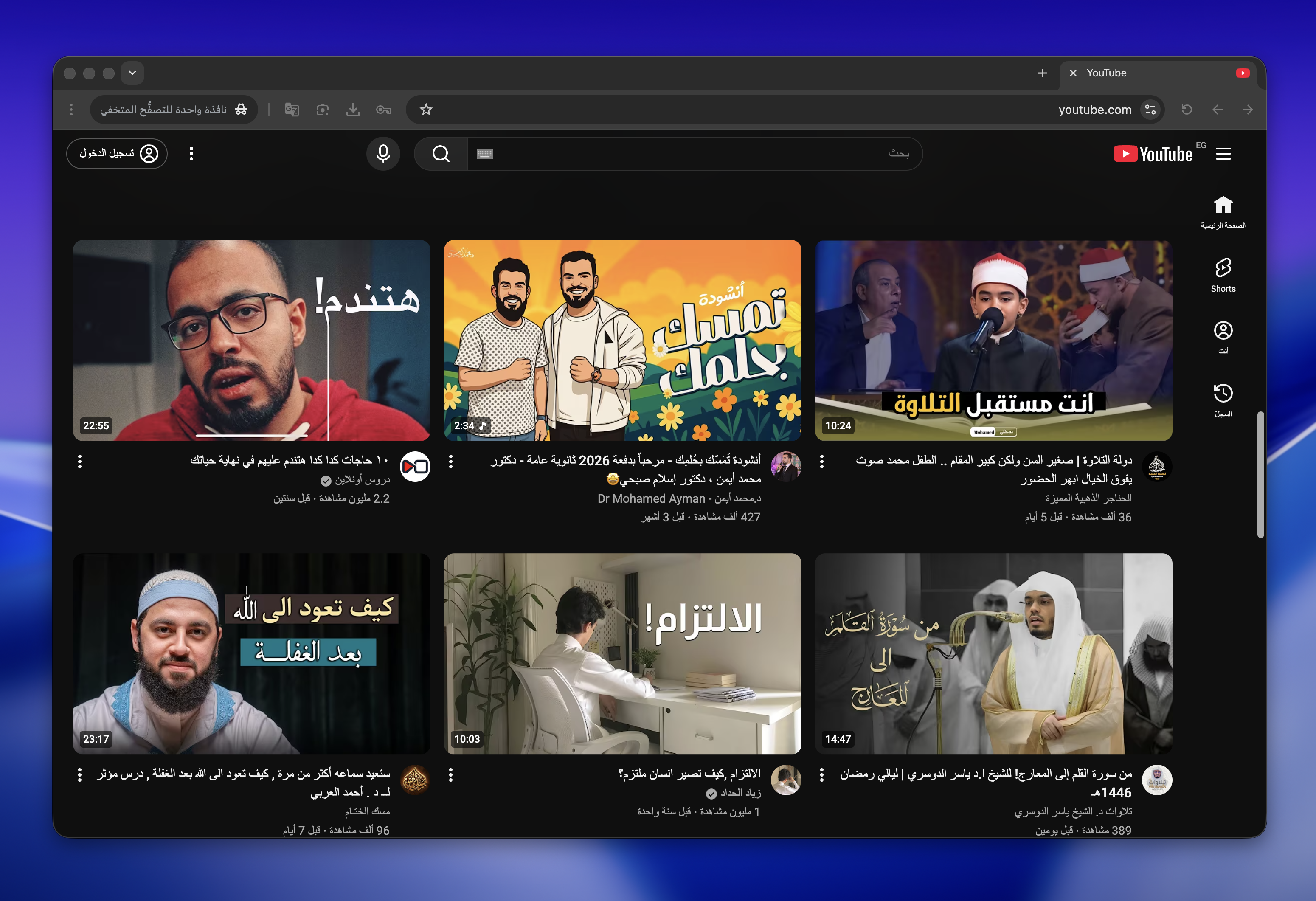
YouTube is one of the clearest examples of similarity in action.
How YouTube Applies the Law of Similarity
All videos appear in cards with the same shape and size.
Thumbnails follow the same visual structure.
Titles use the same font size and placement.
Channel icons and play indicators follow consistent styles.
Sections (Videos – Shorts – Live) share a unified layout.
The result?
The brain predicts patterns effortlessly and scans the screen quickly.
3 Advantages of YouTube’s Use of Similarity
1) Faster screen scanning
Repeated visual patterns guide the eye smoothly.
2) Strong sense of order and consistency
A structured interface increases trust.
3) Lower cognitive load
The user doesn’t need to relearn the interface with every scroll.
3 Drawbacks Despite Applying Similarity Well
1) Visual monotony
Too much consistency can feel repetitive or boring.
2) Hard to notice new elements
If a new feature looks too similar, users may overlook it.
3) Ads blending into video cards
Because ads are designed to mimic video cards, they can be misleading.
Conclusion
The Law of Similarity isn’t just a visual preference—it’s how the brain makes sense of complex information.
Use it well, and your product becomes clear, predictable, intuitive, and enjoyable.
Ignore it, and you create confusion, noise, and cognitive overload.